
Wednesday, 11 March 2015

Evaluation Question 5
In our title sequence we had the main actor, who was myself, and I played the Male teenage protagonist who ran away from home due to domestic abuse from his farther. We also have a background actor, who is Lloyd.The story line and genre is very interesting yet it is also a story people can relate to, because there are so many people in these situations or know someone who is or was. The genre is catching for our target audience because it's realistic and intense as we focus on a strong but depressing situation of homeless and abuse . The location were chosen because it shows the transition from a rural area , to the suburbs and then to central London, which shows the extent the character is willing to go to get away from this abuse. We filmed in Trafalgar square to show him out of his comfort zone and to create a time-lapse.
The rough cut feedback gave us a lot of criticism so we had a lot of work given. We took this constructive criticism and used it to improve our title sequence. We had to remove a scene where the water bottle turns switches to the fathers hand, but had to get rid of it, due to the fact the viewers didn't think it made sense. I feel this feedback allowed us to become aware of every single imperfection in title sequence and allowed us to improve them.
We managed to advertise our film and try to grab attention of our target audience via social media, due to the fact that most of our target audience use social media. We made a Facebook page created by myself, to grab attention of people who would be interested in our film and also allowed us to advertise our film for free and to link it to our title sequence on vimeo. I also created a sound cloud to promote the soundtrack produced by myself and Lloyd, because a lot of people in our target audience range use apps such as this.

Evaluation Question 5 - How Did You Attract Your Audience ?
We think the conventions of our title sequence appeal to our target audience as we tend to focus on the certain aspects.In the start of the movie we wanted to make sure that the bedroom looked as if it was a male teenagers bedroom.We had books to show he was in education and enjoyed reading .We also didn't put any electrical items minus his phone , as he is abused.
We had 2 actors , Yung Lolo who was the Male teenager who ran away and we had a background actor who goes by the name Lloyd , Who will later befriend Lolo.The story line is very intriguing for the audience . The genre again is interesting for the audience . The genre is interesting for our audience because it's a more thoughtful and intense than most teen films , as we focus on a serious matter of homeless and abuse . The location were chosen because we wanted be adventurous and wanted to show the distance travelled by Yung Lolo , this why our shots went from a rural area , the suburban estate and then to central London . We filmed in Trafalgar square as we introduced our second character here but never actually showed him as a main character and this allowed us to film the time lapse as it flowed well with the storyline and it is also allowed due to film a successful time lapse .These Locations allow children from London to relate and may want to how the iconic city they live in made it to the big screen .The Title 'The Run' , has a ambiguous sense , which will make the audience want intrigued and it also implies action. Lolo Productions and Group 16 studies , these are production companies that specialise in Teen Drama films so hopefully they will recognise these two companies .
The rough cut feedback did give us a lot of things to work on , we took this criticism and used it in a constructive manner to improve our film.We had to remove one scene where the water bottle turns into a alcohol bottle in the father's hand .However this made the film more confusing as we did not have another reference to this man , so taking it out was the better option here . This feedback helped and it made us become aware of the miniature details that can make sections of the title sequence improve our camerawork and editing .
As should be obvious we have come to our gathering of people by distinctive manifestations of media, for example, Facebook occasions, tabloid article, YouTube and so forth. These are only a couple of the media ways that we could achieve our group of onlookers by speculation what they do most, for example, going on YouTube, staring at the TV or simply wandering the web.Also we used sound cloud to promote the soundtrack produced by upcoming producers Ketchup on Bun .
Our wider audience , would be adults who were interested in other youth Dramas such as Kidulthood .These people are referred to as ' urban adults', this due to the fact we are discussing a serious matter which is homelessness and adults may want to be informed on such a serious issue .
After the cinema screening that happened at the screen in angel , we questioned pupils and staff on did the title sequence appeal to them and the main response given was through the music we created on garageband, it it assisted our story-line by showing us the mood of the teenager and how he felt about running away from home. The time-lapse was also enjoyed by many , they thought it was unique, as we successfully showed the transition of light to dark through this , this was not tried by any other group .Although they thought the camera work at the end was rather shaky , this could have been improved . The editing the audience also thought that it was fluid and it all came together and the titles also fitted in well into the title sequence.
 |
| This Location is known as Trafalgar Square, this is a well known location for teenagers who live in London , as they have probably visited here before , or at least know of it . It helps make the Film more realistic as this an actual place for a actual problem . |
 |
| This is the scene with our young Male Protagonist , he can be related to as he comes from a working class background and doesn't appear ro be well of , this makes us more sympathetic and gravitate towards him more ,as he is less well of , therefore we like him as we learn how well off we have it compared to him. |
 |
| This was the shot that took , due to that fact it made our film not flow and created too much confusion as there is no other reference to the father .Therefore we took this out to avoid conversion . |
Evaluation: Question 5 How did you attract/address your audience? Draft
Our general target audience was teenagers and urban adults. These are the general target audience for a youth drama.
The aspects of our opening title would appeal to our target audience because we use very dramatic music and our main title sequence is very relatable to the youth society of today, as we know from the conventions from youth dramas that are released in latest years. In our mise en scene we used very generic teenager settings, such as the bedroom of the child, and the streets to show homelessness. We also used the streets of London that we usually see in generic youth dramas. We had books and the wallet as a close up in the title sequence. We shot him running away and this would attract our audience of teenagers. The style of our titles would allow attract our target audience because they're very professional and simple. They would attract our wider audience of urban adults.
After the cinema event that happened in our college, we asked pupils and staff how did the title sequence appealed to them and they all mainly said through the music we created on garageband, it really helped the storyline come alive and show us clearly how the boy is feeling about running away from home. They really enjoyed the timelapse, they thought it was very original and not many people have done that before and they would we did it successfully. However they did think the camera was a little shaky in some place and those places could be improved. The editing the audience also thought that it was fluid and it all came together and the titles also fitted in well into the title sequence.
This our feedback that received when we presented our idea for this title sequence.
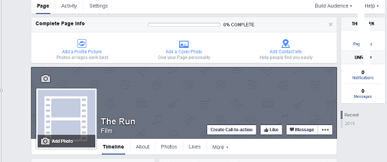
As you can see that we have reached our target audience through by different forms of media such as; Facebook page, Vimeo and soundcloud.


The aspects of our opening title would appeal to our target audience because we use very dramatic music and our main title sequence is very relatable to the youth society of today, as we know from the conventions from youth dramas that are released in latest years. In our mise en scene we used very generic teenager settings, such as the bedroom of the child, and the streets to show homelessness. We also used the streets of London that we usually see in generic youth dramas. We had books and the wallet as a close up in the title sequence. We shot him running away and this would attract our audience of teenagers. The style of our titles would allow attract our target audience because they're very professional and simple. They would attract our wider audience of urban adults.
We only had 1 actor which was the main actor in the movie which was running away from home and we showed how alone and homeless he is, especially in the time lapse. If we had enough time to do a trailer for our title sequence, it would attract a lot of teenagers and adults to our project. The sub-genre of our title sequence isn't a funny film but dark and intense like most of teen dramas that you see in the film industry and it relates to the newspaper. The location was chosen because it shows the process and the story of the main character running away from home, from the rural area to the urban central London. This would appeal to our target audience because we used well known locations such as Trafalgar Square and Piccadilly Circus.
In our rough cut feedback did give us a lot of feedback, and a lot criticism and it made our movie a lot better because of it. There were a couple of shots that we had to delete because it wouldn't have made sense in the title sequence,we had to delete the alcohol bottle shot and we had to shorten the timelapse to not bore the audience. We wanted to include a vodka bottle to show the reason why he was running away however it should make sense in the end. With the feedback it made us concentrate on the little details such as the music of our title sequence, we kept having to change it to make it more dramatic and more appropriate. When our target audience saw the title sequence they were not very impressed because our rough cut was 17 minutes long and completely unedited, they thought it was boring and unfinished because it was just the clips chunked together and they were not edited at all with out any effects.The rough cut appealed to our audience because when they gave there feedback they said that they would watch it if it was properly edited and gave a clear message however at the time, it didn't give a clear message. They mentioned in the final draft of our film, that they really liked it, because the shots were very creative and it really creates sympathy for the main character, this shows that our title sequence attracts our target.
In the pictures below we made some changes to our title sequence by doing other moving shots and in the first picture of Trafalgar square that was filmed on an IPhone that we shot to make the audience understand more of the storyline.


This alcohol bottle shot that we deleted to make the video flow more.

In the pictures below we made some changes to our title sequence by doing other moving shots and in the first picture of Trafalgar square that was filmed on an IPhone that we shot to make the audience understand more of the storyline.
This alcohol bottle shot that we deleted to make the video flow more.
After the cinema event that happened in our college, we asked pupils and staff how did the title sequence appealed to them and they all mainly said through the music we created on garageband, it really helped the storyline come alive and show us clearly how the boy is feeling about running away from home. They really enjoyed the timelapse, they thought it was very original and not many people have done that before and they would we did it successfully. However they did think the camera was a little shaky in some place and those places could be improved. The editing the audience also thought that it was fluid and it all came together and the titles also fitted in well into the title sequence.
As you can see that we have reached our target audience through by different forms of media such as; Facebook page, Vimeo and soundcloud.
This is the Vimeo video that was shared on the platform by the college.

Our Vimeo video that was displayed for our target audience.


Our Vimeo video that was displayed for our target audience.
.png) This is our Soundcloud.
This is our Soundcloud. EVALUATION: Question 6

If you have an error watching the video I made to complete this question, I also did a slide version. It features very similar content. Only read if the video format isn't working.
Sunday, 8 March 2015
Skill Developement
Research
During the research stage, I was able to look into statistical data and internet polls to help improve my work. For example when deciding how to design the logo for the production company, I decided to turn to a survey online, where I was able to ask the general public what was their preferred colour scheme. This was useful as rather than going on personal preferences, I was able to step back and listen to the majority view, which would in tern benefit the project. I was also able to research into valid statistics such as the demand use of social media platforms, which allowed me to decide how best to market our project in terms of what suited our demographic.
Planning
I faced some difficulties during the planning stage of the process. Setting dates to film with the group was sometimes difficult, as all members had other commitments that meant that sometimes we were not always available. However because we planned a few weeks early, this meant that we were able to extend our deadline and plan extra days to make sure the work was completed.
Filming
The filming process was successful. We were able to film our scenes in all of the locations we had planned, and the final result is similar to that of the story board we wrote. However one problem we faced was leaving the filter over the lense for one day of filming. This meant that our footage was corrupt and we had to reshoot some of our clips. This was easily overcome due to our safe planning schedule, and we were able to shoot all our clips in the alotted time. During filming, I was in charge of photography, and had to make fast decisions about elements such as angles and movement of camera. I enjoyed this, as I was able to explore different ways of presenting a story, for example using high angles to emphasise changes in status. One set of clips I was particularly happy with were my time lapse clips of the city. I was worried that the sitting time lapse of the main character was going to fall through, so I decided to take a variety of fast speed clips of London. For example moving traffic, and the general public. This could then be edited into the final piece for some added dynamic and to firmly set a location.


Editing
One skill I enjoyed learning during the editing process was how to change the aperture post-production. This meant that I could decide what I wanted to be in focus (depth of field) and then was able to blur out surrounding footage using photoshop. This was largely successful during the scenes of the boy sitting down. With close up shots, I was able to select the foreground of his face, while have the lighting and public as an off focus background. This made the clips look more professional, as it was clear we were trying to direct the audience. One problem I encountered with this technique was that it had to be set manually by using plotted digits. This made the process very long winded, and I ended up not being able to apply this to every clip as it was too time consuming, which effected the consistency of the style.
Blog Construction
The construction of the blog was my favourite part of the process. I was able to contact a reputable designer and learn directly about aspects of blog design such as colour scheme. By using this new knowledge, I was able to further my planning skills and create a blog which was clean cut and fitted the style of work. I also used some of my skills in coding to enhance the blog, like for example using CSS to change the format of images on the blog. One skill I wanted to use however did not have the chance to was HTML5. As I am currently learning this coding language, it would have been useful to transfer these skills across to the design of the blog. However I did not have enough time to write out the pages of code nessercary, and had to use alternate methods to construct the blog correctly.
During the research stage, I was able to look into statistical data and internet polls to help improve my work. For example when deciding how to design the logo for the production company, I decided to turn to a survey online, where I was able to ask the general public what was their preferred colour scheme. This was useful as rather than going on personal preferences, I was able to step back and listen to the majority view, which would in tern benefit the project. I was also able to research into valid statistics such as the demand use of social media platforms, which allowed me to decide how best to market our project in terms of what suited our demographic.
Planning
I faced some difficulties during the planning stage of the process. Setting dates to film with the group was sometimes difficult, as all members had other commitments that meant that sometimes we were not always available. However because we planned a few weeks early, this meant that we were able to extend our deadline and plan extra days to make sure the work was completed.
Filming
The filming process was successful. We were able to film our scenes in all of the locations we had planned, and the final result is similar to that of the story board we wrote. However one problem we faced was leaving the filter over the lense for one day of filming. This meant that our footage was corrupt and we had to reshoot some of our clips. This was easily overcome due to our safe planning schedule, and we were able to shoot all our clips in the alotted time. During filming, I was in charge of photography, and had to make fast decisions about elements such as angles and movement of camera. I enjoyed this, as I was able to explore different ways of presenting a story, for example using high angles to emphasise changes in status. One set of clips I was particularly happy with were my time lapse clips of the city. I was worried that the sitting time lapse of the main character was going to fall through, so I decided to take a variety of fast speed clips of London. For example moving traffic, and the general public. This could then be edited into the final piece for some added dynamic and to firmly set a location.
One skill I enjoyed learning during the editing process was how to change the aperture post-production. This meant that I could decide what I wanted to be in focus (depth of field) and then was able to blur out surrounding footage using photoshop. This was largely successful during the scenes of the boy sitting down. With close up shots, I was able to select the foreground of his face, while have the lighting and public as an off focus background. This made the clips look more professional, as it was clear we were trying to direct the audience. One problem I encountered with this technique was that it had to be set manually by using plotted digits. This made the process very long winded, and I ended up not being able to apply this to every clip as it was too time consuming, which effected the consistency of the style.
Blog Construction
The construction of the blog was my favourite part of the process. I was able to contact a reputable designer and learn directly about aspects of blog design such as colour scheme. By using this new knowledge, I was able to further my planning skills and create a blog which was clean cut and fitted the style of work. I also used some of my skills in coding to enhance the blog, like for example using CSS to change the format of images on the blog. One skill I wanted to use however did not have the chance to was HTML5. As I am currently learning this coding language, it would have been useful to transfer these skills across to the design of the blog. However I did not have enough time to write out the pages of code nessercary, and had to use alternate methods to construct the blog correctly.
Blogging Health Check
During the primary stages of the blog posts, my feedback was relatively positive. I was informed that I had good ICT skills and was able to expand on my posts with a good level of understanding. However unfortunately my mark seemed to drop down as time went on, as I was not posting frequently enough. To avoid this, I decided to set a blogging posting schedule, where I could save posts and have them uploaded at regular intervals during the week. I wanted to keep up the good use of ICT, and continued to stretch myself, for example in my Blog Design posts where I mention the coding I learned to enhance the blog, or in a Schedule post where I managed to create a gif. A second point that was raised about my blog work was the levels of consistency, as some group posts did not have a large amount of detail. This meant that I had to go back into some of the group posts that some group members had done in order to expand on their points. (For example in the footage review blog post.)
Facebook Page Research
Wanting to focus on the marketing aspect of the title sequence and production company, I decided to research into advertising techniques. Hopefully by increasing advertisement, we can gain more support for our production and in tern, increase branding for LoLo Productions.

Before achieving some publicity, I decided to look into the advantages and disadvantages of increasing publicity online.
Advantages:


As the table shows, the largest demographic that uses social media is the younger generation. This means that rather than traditional sources of media such as newspapers or posters, online marketing such as pages and adverts are likely to reach the younger audience our company is targeted towards.
Before achieving some publicity, I decided to look into the advantages and disadvantages of increasing publicity online.
Advantages:
- Online marketing is free/very lost in cost
- Large amounts of people use the internet on a daily basis, therefore you are likely to reach a large demographic
- Being online means that people across nations are able to view your company, increasing international target marketing
- Internet advertising can be more targeted than traditional media. For example, posting to social devices such as Instagram would appeal to a younger, visually aware demographic, while SoundCloud users would be interested in the music of a company.
Disadvantages:
- Marketing materials are automatically available for anyone to copy. Logos, images and trademarks are easily saved and reposted, regardless of legal implications. This could damage the company's reputation if the wrong things are posted.
- Advertising and companies who use social media has began to 'clutter' the web. adverts can be classed as 'spam' and therefore are not read. Also as advertising and company pages are now so common, people tend to overlook or ignore them in comparison to traditional media.
Deciding what platform to use
 |
| As the graph shows, Facebook has the highest frequency of young users. This would make it an appropriate platform to use to promote our company. However unlike Facebook, other social media platforms such as LinkedIn have a rising number of users, where as facebook has not has such a demanding level of progress. This could be a problem, as the younger demographic we are hoping to reach could move towards the newer and larger growing platforms. Our Facebook Page |
TImbleTable: How We Used Our Time
This is how we use our media sessions, which are Monday 3:05-4:35 and Wednesday 9:00- 12:15 With a 15 minute break at 10:30. We also planned in some extra dates during the weekend so that we could spend long periods of the day filming during daylight. Wanting to film during hours where the public would interfere with our shots, we made sure that outdoor scenes were filmed during the week. This was a good idea as it meant that scenes such as the marshland, Trafalgar square and backstreets were not as busy, and our main character remained centre focus.

Friday, 6 March 2015
Deadline day
So Today , two members of the group came in to finish the Title sequence, Some Feedback we gathered from out teacher Louisa was based on the sound . So we edited the sound but lowering the volume as the transition of new sounds were too abrupt.We also edited some of the music by placing some strings ,as the music was too boring and needed a build up , we manged to fit it in with a new scene and once it was over we took away these sounds to gain a more sympathetic tone .

Thursday, 5 March 2015
Loic's Feedback
Pupils feedback on The Run
One aspect of the film that they found particularly intriguing was the use of speed within our piece. They liked that time was increased to show his duration of time outside.
One aspect of the film they didn't like was the original soundtrack. They thought that even though the music was smooth, it didn't correspond to the mood of the piece.
To improve our work, we have decided to redraft our soundtrack so that it echoes a more sympathetic tone, which is what we intend our audience to feel.
Wednesday, 4 March 2015
Reflection - disappointment
One of the scenes we had in the film had to be taken out . This was a disappointment as this demonstrated why the Teenager was running away ,It was a shot of a volvic bottle which then transition to my hand holding a beer bottle.This was meant to demonstrate the dad being a alcoholic . As the father only made one appearance it was confusing to use him as a character , also this is only a title sequence so we do not want to give away too much . The transition never worked as we expected and slowed down the film and made it a lot more confusing , so to make the film flow better we had to take it out.
Blog Design
The initial design of the blog used a simple white background with a standard Times New Roman font. Without any design, shapes colour or intricate style, the layout of the site seemed amateur.

This is the first attempt at designing the header. I used the 2nd row of the colour theme to create this header. Using blacks for the font, shadowing around the template and to outline the font. This works well because it allows the header to stand out. However the shadow effect isn't smooth, which makes it look messy. Wanting to incorporate the production company into the title, a redraft would be necessary. After talking to my group, we decided that a second draft of the header would be best.


Colour Scheme
Wanting to get a better idea of colour scheme, and to gain a professional outlook on design, we contacted blog designer Marianne Dey through twitter. I was interested in her style of design, and after visiting her website, I was able to contact her with the appropriate questions. My main concern was colour, and I wanted to understand how colour can contribute to the impact of a blog page. She was able to send me her E-Book, which explained the process of colour selection.
I leant that most colour schemes have two parts. The complimentary colour and the accent colour. A complimentary colour sits beside your main colour on the colour wheel. For example blue and purple. Both colours share similar hues but work harmoniously to create a mood. Blues, Greens, Purples and greys will have a serious and colder tone, whilst oranges, pinks reds and whites would have a positive impact. An accent colour sits opposite the main colour on a colour wheel. Because it shares no pigments with the main colour, it creates a contrast and makes the design stand out.
Colour Planning
 |
| *NOTE* The image has been saved with brown tones, however these are actually shades of grey in photoshop |
Using photoshop, I was able to create a colour palette so I could see the different hues and how they work together.
Row 1 uses the shade of black, and slowly fades out to white. I wanted to experiment with tones because the shadows could give a 3D effect to the page. Even though I like this idea, I think that the
colours aren't interesting enough to hold the attention of a younger demographic.
Row 2 This is one of my favourite rows. It uses dark colours which emphasises the dark theme to our title sequence and production company. The light blue/green colour allows me to highlight important aspects of the page, and the off white can be used for text and body.
Row 3 I wanted to follow this idea of using opposite colours. I used purple and greens which emphasises the design. A problem with this colour palette is that it uses bright and vibrant hues, which would be a negative contrast against the dark theme of the production logo and imagery.
Header Draft
This is the first attempt at designing the header. I used the 2nd row of the colour theme to create this header. Using blacks for the font, shadowing around the template and to outline the font. This works well because it allows the header to stand out. However the shadow effect isn't smooth, which makes it look messy. Wanting to incorporate the production company into the title, a redraft would be necessary. After talking to my group, we decided that a second draft of the header would be best.
Second Draft
This is our second draft, which used the logo style of our production company as a banner. By doing this, we were able to connect both aspects of our work together which creates an element of unity between our practical work and our blogging work. We set this is our header and changed the surrounding colours of the blog to match this. this was our outcome:
One problem with the dark colour theme was that the text became difficult to read. We set a poll on the website SurveyMonkey asking the public whether they prefer light tones or dark tones on a website. Our results showed that 87% of the public prefer light backgrounds with darker text appose to dark backgrounds beneath light writing. Therefore in our final blog design, I have decided to revert the colours so that they were easier to view.
Final Blog Design
This is our final blog design. It uses light colours giving a clean and minimal look. We used black to accentuate text and font style, and harmonious shades of blue as our accent. Overall, I think that this design makes the blog accessable to a visitor, and with the scribbled graphics and vivid colours, our branding stands out enough to draw in the attention of the reader. One problem I had when inserting the header was that it was placed in to the left rather than centred. To change this, I used a simple piece of CSS coding which I then implanted into the coding of the website so that the computer would automatically reset the header into the middle of the page.
 |
| I also used some CSS that I then applied to the general template so that the borders and shadows that are formatted around the picture are presented seamlessly onto the page. |
Rough Cut
This is the rough cut of our footage , this was the process of us selecting the relevant footage .
editing
As it is getting closer to our deadline we are taking editing as our main priority. So in these screenshots we have a picture of Serge working on our title sequence by editing the shots by shortening them to the correct lengths.


SoundCloud Drafting
We created a SoundCloud account so we can advertise the music for our title sequence. By putting our music on the internet we can attract those who are interested in original pieces, therefore gaining publicity for our piece.
We decided to use our production logo as the profile picture in our SoundCloud account. By doing this, we heighten brand recognition as both our Facebook, SoundCloud and blog all share the same images.
We decided to use our production logo as the profile picture in our SoundCloud account. By doing this, we heighten brand recognition as both our Facebook, SoundCloud and blog all share the same images.

Tuesday, 3 March 2015
Lo-Lo Productions Logo Drafting
We wanted to market our piece with strong branding and clear representative images, we decided to experiment with logo design for both our production company and our film. Before designing an outcome, we looked into other production companies.

This logo appealed to us because I liked the vivid use of colours against a dark background. This allows the logo to stand out, giving the branding instant strength. I think it would be a good idea to replicate this, and use a dark background with bright colours.


This logo appealed to us because I liked the vivid use of colours against a dark background. This allows the logo to stand out, giving the branding instant strength. I think it would be a good idea to replicate this, and use a dark background with bright colours.
I particularly liked the use of lines in this logo. As well as the strong impact this has on the surrounding font, I think that the use of lines gives the company an 'edgy' mood which would suit the theme of our title sequence.
First Draft
This is the first draft of our production design. We used strong lines and a simple colour scheme. We decided to do this because it creates a clear and simple image, and draws focus to the brand name rather than design. We shared our logo with two fellow students, who had some criticisms about our initial design.
Strong points:
- Good use of colour, they liked the simple black and white design, and called it 'classy.'
- Liked the use of lines, it strengthened the image by having direction
Weak points:
- There isn't a strong link between the design and the company, it has no resemblance or clues that it is related to film or production.
- The lines are too distracting, the font becomes lost in the image.
Draft 2
This draft is a major improvement on the previous logo design. By using scribbled lines, our logo gained more character, and I think gives our production company the edgy serious tone that you would expect of a teen drama company. We also had to use two tones for the font (mint blue and white) because otherwise the writing would be lost in the image.
One problem with the logo is that it might look too messy for the company's image. Also the size of text is quite small, and if a priority is image branding, this may have to be changed for the final design.
Final Design
Using a larger font with a smaller use of lines, we were able to gain focus on the name of the company rather than design. The use of blue is normally related with youths, with brands such as Mike and Adidas using blues to contribute to sport and energy. Therefore blue was an appropriate colour choice that would appeal to our younger demographic.
The making of a WIX website
Group 16 want to create a free website to promote the title sequence to our target audience which is mainly teenagers as a core audience but also adults as a 2nd audience. This will have information about the cast and an actor that started in the title sequence and general information about the production company and other information about the title sequence.

Monday, 2 March 2015
The editing process
We started the editing process and we have started putting together a rough copy of our movie. Since the deadline is this week, we are allocating extra time so our title sequence has a higher quality. We sorted out our clips and put them into our timeline. Next we will be still editing and also producing title sequences and sound.

Subscribe to:
Posts (Atom)